American Eagle

Designing Loyalty Understanding - A UX Design Challenge

About American Eagle

American Eagle has offered an assortment of specialty apparel and accessories for men and women that enables self-expression and empowers our customers to celebrate their individuality. The brand has broadened its leadership in jeans by producing innovative fabric with options for all styles and fits for all at a value.

Overview

As part of a UX design challenge for American Eagle Outfitters, I was tasked with developing a unique A/B test hypothesis and designing multiple high-fidelity variants for the authenticated account page within the AE + Aerie mobile app.

Since 96% of app users are already logged in, the focus was exclusively on the authenticated experience. The goal was to rethink how Real Rewards tier status and benefits are surfaced within the account page without replicating the full loyalty dashboard. I completed and presented this challenge within 48 hours, simulating a real-world product sprint environment where rapid iteration and hypothesis-driven design are critical.

The challenge required:

  • Formulating one clear, testable hypothesis

  • Designing a control-based experiment with 3–4 unique variants

  • Maintaining all existing functional requirements

  • Delivering a single Figma art board presenting control and variants side by side

Final Designs

Tested whether elevating the most critical tier information to the top of the account page improves immediate comprehension.
Focused on reducing scan time and helping users quickly identify:

  • Current tier

  • Points needed for next level

  • Key perks

Primary metrics:
Time spent on page, modal open rate, scroll depth, CTA click rate.

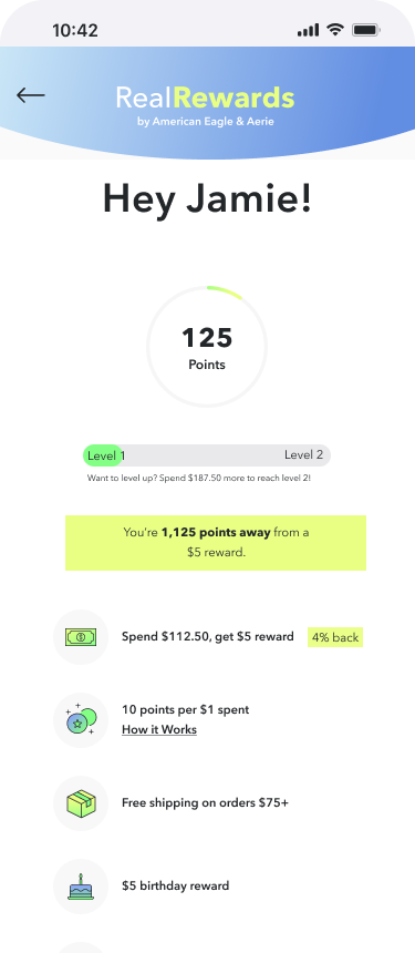
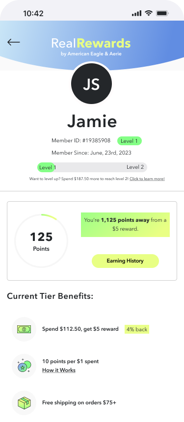
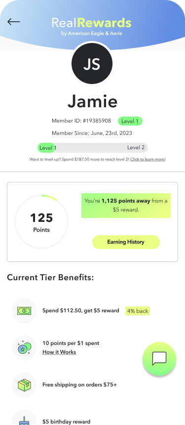
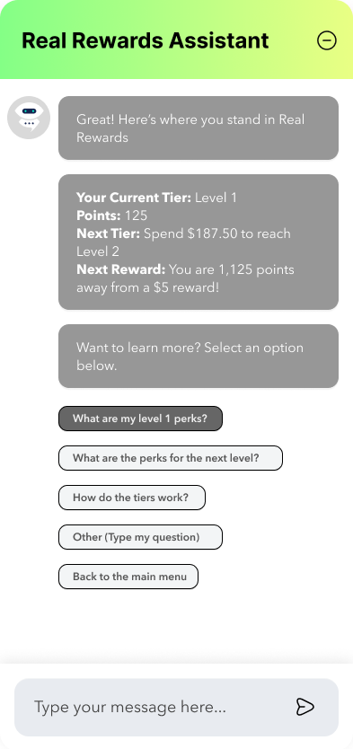
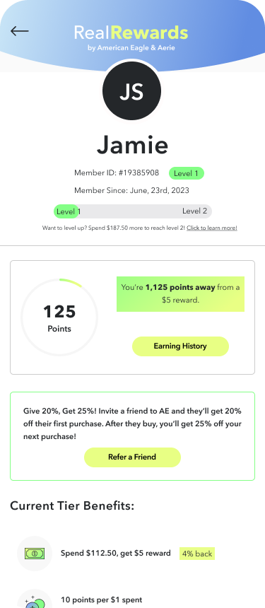
Tested whether consolidating tier status, benefits, and progress into a structured dashboard format reduces cognitive load and increases engagement.

Emphasized visual grouping and hierarchy clarity to create a more systemized loyalty overview.

Primary metrics:
Understanding of tier benefits, engagement with rewards modules, navigation to full dashboard, CTA interaction rate.

Tested whether introducing contextual AI assistance reduces friction in understanding rewards and increases self-service engagement.

Focused on discoverability of information through conversational or guided prompts.

Primary metrics:
Referral engagement (if surfaced), modal open rate, interaction with assistance entry points, overall engagement lift.

Tested whether adding visual gamification (badges) and a prominent “Refer a Friend” CTA increases motivation, referral engagement, and loyalty interaction.

Introduced behavioral reinforcement elements designed to:

  • Encourage progression

  • Highlight earning opportunities

  • Increase social sharing behavior

Primary metrics:
Referral CTA tap rate, referral engagement, scroll depth, overall CTA click rate.

Approach and Design Process:

Hypothesis Formation & Experiment Strategy

Primary Hypothesis:
Increasing the visibility and hierarchy of Real Rewards tier status and benefits within the account page will improve users’ immediate understanding of their loyalty value, leading to higher engagement with rewards features and greater motivation toward tier progression.

Structured the solution as a multi-variant A/B/C/D experiment, ensuring each variation isolated a distinct hierarchy or visual emphasis change rather than superficial UI adjustments. Established measurable behavioral signals that could validate the hypothesis, including:

  • Engagement with rewards modules

  • Navigation to the full Real Rewards dashboard

  • Interaction with progress indicators

  • Click-through on benefit-related CTAs

Wireframing & High-Fidelity UI Design

Developed low-fidelity layout explorations to test different hierarchy models, including varying placement of tier status, benefit summaries, and progress visualization components.

Translated selected concepts into high-fidelity mockups aligned with AE’s mobile UI system and brand standards. Designed each variant to maintain current functional requirements while introducing differentiated approaches to:

  • Tier prominence

  • Progress visibility

  • Benefit reinforcement

  • Motivational cues

All variants were presented side by side on a single Figma artboard to simulate a real-world design review and experimentation setup.

Variant Strategy & Differentiation

Designed a Control + A/B/C/D experiment, with each variant testing a distinct hierarchy or engagement shift aligned to the primary hypothesis.

  • Control (Existing AE UI): Baseline to measure current tier visibility and rewards engagement.

  • Variant A – Simple Rearranging: Elevated tier status and progress to improve immediate comprehension.

  • Variant B – Dashboard Layout: Consolidated tier details and benefits into a structured dashboard to increase clarity.

  • Variant C – AI Assistance: Introduced contextual AI guidance to reduce friction and support self-service.

  • Variant D – Gamification + Referral CTA: Added badges and a prominent referral call-to-action to drive motivation and engagement.

Iteration & Hierarchy Optimization

Refined spacing, typography, and modular structure to improve clarity and balance information density with scannability.

Focused on making key loyalty information immediately recognizable:

  • Tier Visibility: Ensured current status was prominent and easy to identify.

  • Benefit Clarity: Highlighted core perks without duplicating the full rewards dashboard.

  • Progress Transparency: Made advancement toward the next tier clear and motivating.

Applied progressive disclosure to keep the account page streamlined while reinforcing loyalty value and engagement.


Final Solution & Impact

Structured A/B Experiment Framework: Designed a Control + A/B/C/D test to evaluate distinct hierarchy and engagement strategies within the Real Rewards account experience.

Improved Tier Visibility & Clarity: Elevated tier status, benefits, and progress indicators to help users quickly understand their loyalty value.

Engagement-Driven Variants: Introduced dashboard, AI-assisted, and gamified referral models to test motivational and behavioral impact.

Metric-Oriented Decision Making: Mapped each variant to measurable signals such as CTA interaction, rewards engagement, dashboard navigation, and referral activity.

Rapid Execution & Presentation: Completed and presented high-fidelity solutions within a 48-hour sprint, simulating a real-world product testing environment.

Key Takeaways & Reflections

💡 What I Learned:

  • Experimentation design is just as important as interface design — isolating variables clearly leads to more meaningful product insights.

  • Loyalty experiences require precision in hierarchy; small shifts in visibility can significantly impact comprehension and motivation.

  • Designing multiple strategic directions in parallel strengthens decision-making and prevents attachment to a single solution.

🚀 Next Steps:

  • Validate the hypothesis through live A/B testing and analyze behavioral signals across variants.

  • Refine the highest-performing concept to further optimize tier progression and long-term engagement.

  • Explore deeper personalization opportunities to dynamically surface loyalty value based on user behavior.

Explore the Full Variants Here...

This project was designed as a structured A/B test framework.
Access the complete high-fidelity artboard to explore each variant, supporting interaction states, and testing structure in detail.