Crema – Jog

Experience Studio I: Crema

Duration
4 Months (Spring 2019)

Contributions
Primary Research
Secondary Research
Wireframing/Prototyping
User Testing

Teammates
Sneha Mulki, Deanna Bell, Jingle Chen, Robin Arnold, Benjamin Frailey, Shantanu Kashyap, Jake Ledford

About Jog

Jog is a customer relationship management tool that aids the user in easily and quickly jogging memories of important conversations and connections. The primary users are business professionals who have many important contacts, but it can be useful to anyone who needs a way to remember the names of the people they meet. When a user meets a new coworker, client, or employee, they can use Jog to record details about the person, such as their name, their spouse’s name, their occupation, and where they met. Later, if the user can’t remember the person’s name when they meet again, the user can search any of the details to jog their memory.

Project Brief & Goals

Currently, Jog is only available on the App Store for iOS devices. For this project, we
explored potential platforms outside of a mobile application. This could include, but is not limited to, a desktop application, a wearable device, or a voice interface.

For this project, the goals that were included are:

  1. Understanding the current experience of Jog on the mobile app.
  2. Brainstorming ways Jog could be used on different platforms.
  3. Iterating on one idea for further development through testing and analysis
  4. Prototyping high-fidelity mockups to effectively communicate our idea

Design Process:

Research: Secondary Research, Interviews, Co-Design Workshop

Purpose: We decided to conduct research to gain a better understanding of the current Jog
experience and to explore possibilities for future use of Jog. The ultimate goal was
to gather information that would help us scope down during ideation.

Secondary Research – Comparative Research:

Goal: To identify applications similar to Jog that currently exist in the market; to gain
insights by understanding their strengths and weaknesses.

Process: We divided into two groups. One half focused on secondary research for another topic, while the other half identified direct and analogous competitors of Jog. We found five companies worth evaluating due to their success and uniqueness. The team members then created a grid and used sticky notes to list the strengths, weaknesses, and insights of each company, noting potential ideas for iteration during ideation.

Insights: Here are a few key insights from four of the companies that we looked at.

  • Slack (analogous): Slack has applications across both mobile and desktop, and allows integration of other apps such as Google Drive. We looked at this app because it provided
    a good example of the success of synchronization.
  • NameShark (direct): In Nameshark, you can customize and create different groups on the app. We looked at this app because it has quizzes to help you remember names.
  • CamCard (direct): Camcard is an application for digital business cards, where users are able to scan and exchange their ecards while also accessing contact information with an in-app purchase. We looked at this app because it provided us with an example of premium features.
  • Todoist (analogous): Todoist can be used on and synced across mobile, desktop, and smart watch, and has the ability to connect to Google Calendar, Amazon Alexa, etc. This is a good inspiration, as it focuses strongly on ease across platforms and ease of mind about upcoming deadlines.

Takeaways
After we discussed these insights, we created a small list of takeaways that we could refer to during ideation.

  • Synchronization is important for applications that are on multiple platforms.
  • We need to avoid something that is “too advanced” to promote ease of mind for users.
  • We also need to make our design easily integratable into the user’s life.
  • Custom groups is a well received feature.

Primary Research

Purpose: to understand when and how people have interactions with others in their daily
lives; to collect insights from the interview responses to create experience maps

Process: The interviews were conducted individually by the team members with people within Jog’s user group, primarily business professionals but also teachers. Afterwards, the team analyzed notes and discussed main takeaways in class. We interviewed four people in total, 2 females and 2 males.

Protocol Questions: Our questions were geared towards understanding the interactions with others, including when they occur, how the interviewee feels, and how the interviewee currently remembers names.

  • How often do you meet new people?
  • In most cases, can you recognize them if you meet them next time?
    • If yes: How do you handle remembering people and the interactions you had with them?
    • If no: Have you tried any method to help you? Share some examples.
  • How do/would you feel when you recognize someone that you have met
    before, but cannot remember their name/the conversation you had last time?
    • What if someone else recognizes you but you cannot remember them?
  • Have you ever reflected on your interactions? If yes, when and what context?

Interview Takeaways:

Methods in Use

The two most common ways people remember another person’s name is either privately, or internally similar to memorization, or by keeping notes of the person’s features or previous conversations, such as in contacts.

Emotions

People typically feel bad or embarrassed when they can’t remember someone’s name.

Use Cases

People most often meet a lot of other people at conferences, meetings, interviews, and conventions.

Reflection

People typically reflect on their interactions after a while in private settings.

Co-Design Workshop

Purpose: To brainstorm with our sponsors to get in-depth insights about Jog from a new perspective; to help us begin to scope down to a design solution

Agenda: We designed four activities to engage our sponsors in our design process, which include: an icebreaker to make participants comfortable and prepare them for subsequent activities; current storyboarding, where they map out their current experience with JOG; journey mapping, where we chart their experiences from the storyboarding and connect emotions to each stage; and finally, future storyboarding, where we explore how they can experience things beyond the mobile app..

Takeaways: After the workshop, we conducted a quick analysis of each activity to gather insights. We displayed all the user journey maps and storyboards on a whiteboard, then reviewed each activity to discuss the takeaways.

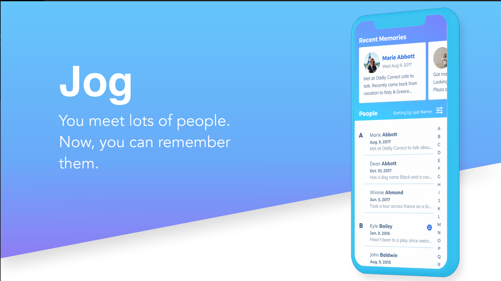
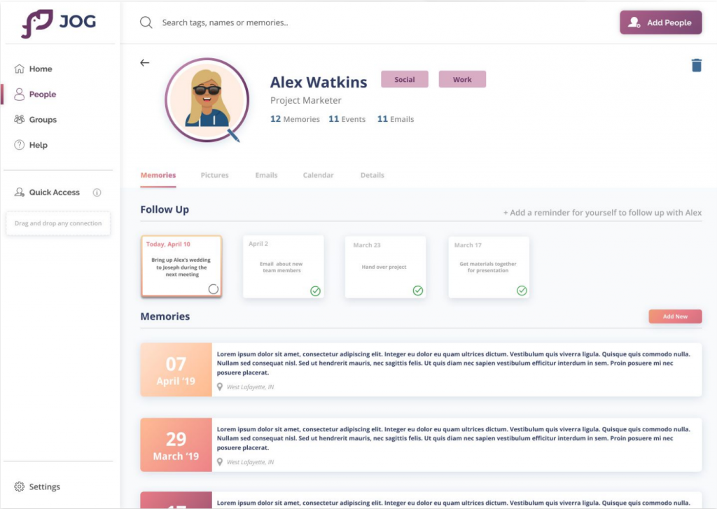
  • Personas: Business professionals frequently use Jog, meeting many people during sales and meetings. They feel bad when they can’t remember someone’s name, but they are too busy to make an effort to remember.
  • Storyboards: Typical scenarios include networking events, meetings, and interviews, where the mobile version of Jog is initially used to help remember a person’s name.
  • User Journeys: During the user’s journey, there is a pivotal point we call the “Oh Crap Moment,” where the user needs to quickly pull out Jog to find the person’s name before the interaction begins. Overall, the journey is stressful, but the user is grateful to have Jog.
     

Scoping Down

Based on our interview and co-design workshop takeaways, we created two experience maps, each depicting a different scenario. Both scenarios involved using the Jog mobile app, but in one, the user successfully found the person’s name, while in the other, they did not. The image below represents these two journey maps, illustrating the experiences a user might have when meeting someone with or without Jog.

Meeting with Jog (left map): The first experience map is when the user meets someone. The user recognizes that person, but cannot remember their name. Luckly, the user is able to find that person on the Jog mobile app quickly before the begin to talk to them.

Insights: the intersection between the
three lines of user’s emotion happens when the user successfully finds the information they were looking for on Jog. We called this moment the “A ha” moment, and to trigger this “a ha” moment during meeting is the main goal of Jog on the mobile platform.

Meeting Without Jog (right map): Similar to the
previous scenario, the user recognizes the person but cannot remember the name
and the conversation they had last time. Unfortunately, the user either cannot open
the app fast enough, or they simply cannot find that person on the Jog mobile app.

Insights: In this situation, the user’s emotions change dramatically compared to the previous
experience map. Relief only comes at the end of the meeting when the user no longer has
to pretend to know the other person. This moment marks a split between happiness and stress, known as the “oh crap” moment. Here, the user realizes they may need to awkwardly ask for the person’s name or avoid using it to feign memory, causing stress to rise and happiness to plummet. They feel bad and nervous about not remembering.

Problem Statement: Working Professionals need a way to balance their professional and
personal life through a better navigation to develop stronger connections
and relationships with people they have met.

Ideation: Initial Sketches

We sketched different ideas that would interact differently with the Jog mobile app. This included extensions to wearables, voice activation, and the idea we eventually stuck with: Desktop Jog. These were just our initial ideas for all of these concepts.

Low Fidelity Mock-ups

A low-fidelity mock-up of our home screen. The user would have a list of all their connections on the home screen, as well as their recently added connections. This would be accompanied by a search bar and a sidebar with other pages.

The groups pages would contain the groups that the users have create. Ideally, a user could add someone to a group to help classify them when adding a new connections.

Usability Testing

We created a protocol that walked the participants through a brief scenario, asking them to complete basic tasks to immerse them, and afterwards asked a few questions about the prototype. For this round of testing, we tested with six students at Purdue University who are unfamiliar with the Jog application, as testing with novice users would help us understand if new users can successfully interact with our wireframes.

Takeaways:
We observed several inconsistency issues with the wireframe. To provide more clarity on the feedback, we listed out all the feedback and attached it to the screen it was based on through a visualization on a whiteboard. We went through each screen and analyzed the feedback thoroughly.

Home Screen:

Participants felt the Connections list was
intuitive to understand and appreciated having the navigation bar on the left side of the screen. Several users where confused with the term“Quick Access,” because there was no indication on what it clearly meant.

“Is this like a favorites contact list?”

Connection Profile:

Participants were confused with the
structure of viewing a connection’s profile page. They felt it was restricted to the options given. They were also curious on how would to go back to the Home Screen.

“I wouldn’t want to see my emails and meetings at the top with someone I remember from my hiking group.”

Groups:

Participants appreciated the simplicity of the
groups page. They were curious to know how to create a new group and add members to it.

Medium-Fidelity Prototype

Connections:
This is the reiterated home page. Instead of having the recently added people on the top of the connection list, we added a “sort by” button, which allows our user to sort the list by a number of attributes.

Groups:
For the group page, we decided to show more information of each group on the main group page to prevent clicking multiple times. In addition, users are able to check specific information of someone in the group by hovering over it.

Create Groups:
In regard to create a new group, users are allowed to add group name, group description, and people into the group by drag & drop.

View Profile:
This is the redesigned profile page. Just to clarify, it is the profile page of the people user add to Jog. We decided not to create a profile page for our users since we were aware that Jog is not a social media, and we thought a profile of the user wasn’t necessary.

Final Prototype:

Welcome Screen
We wanted to include more of what Jog is about, so we took inspiration from Jog’s current website for the text explaining what the product is about. Additionally, we designed based on the colors, brand assets given to us. All of the illustrations are open source illustrations from the net which you could change if you’d like.

Home Screen
For the home screen, we decided to make it more easier for users to find their recent connections. We made it even more helpful for users to remember who their connections are by including flashcards to help “jog their memory” on the people that they met or are about to meet again at any event. We added a special feature which is the “Reflect on memories”. This allows users to get reminders on old events/memories that were created with their connections on JOG.

People Screen
The People page would show a list of all the people they have created memories with and added on Jog so far. There is an option to expand the contact bar to show a short memory of the person as well.

Profile Screen
Once they click on someone’s profile, we added a lot of functionality to the desktop version. The first tab within the profile is Memories. The Follow Up section would show conversation starters you could use when you meet the person next time. In this case, when you’d meet Alex. The next section shows a list of memories you created with the person.

Groups Screen
The Groups page would enable the user to add their connections to specific groups such as Work, Hiking, Project etc. Each group has a description of what the group is about and a list of connections within the group which they can sort using the “Sort By” filter accordingly. They can also create new groups, edit and delete existing groups as well.

Takeaways

We enhanced the app’s personality by adding avatars and a theme consistent with Crema’s brand colors. We also made subtle adjustments, such as ensuring consistent stroke thickness in icons. After these updates to the app’s personality and visual aesthetics, we prototyped them in high fidelity.

Want to read the full design process...

Click the button below to read our fully design process and explanation on our entire final prototype. In this documentation, you will get to read about how our research and ideation got us to our design and why we went with the solution that we produced.