
Experience Studio V: Sezzle
Duration
4 Months (Spring Semester)
Contributions
Team Leader
Primary & Secondary Research
Screening Survey
Prototyping
Teammates
Ariana Eskew, Isa Pino, Thomas Weese, Varun Aravapalli, Ji Won Lee, Enya Song
About Sezzle:
Sezzle is a publicly traded fintech company based in Minneapolis, USA, with operations spanning the United States and Canada. It offers an alternative payment platform, allowing customers to make purchases at participating online retailers through interest-free installment plans, also known as a “buy now, pay later” service (BNPL).
Project Brief and statement
This semester, our team collaborated with Sezzle to develop high-fidelity mockups showcasing a ‘blue sky’ approach to redesigning their app. This innovative direction allowed us to explore areas typically beyond their usual scope.
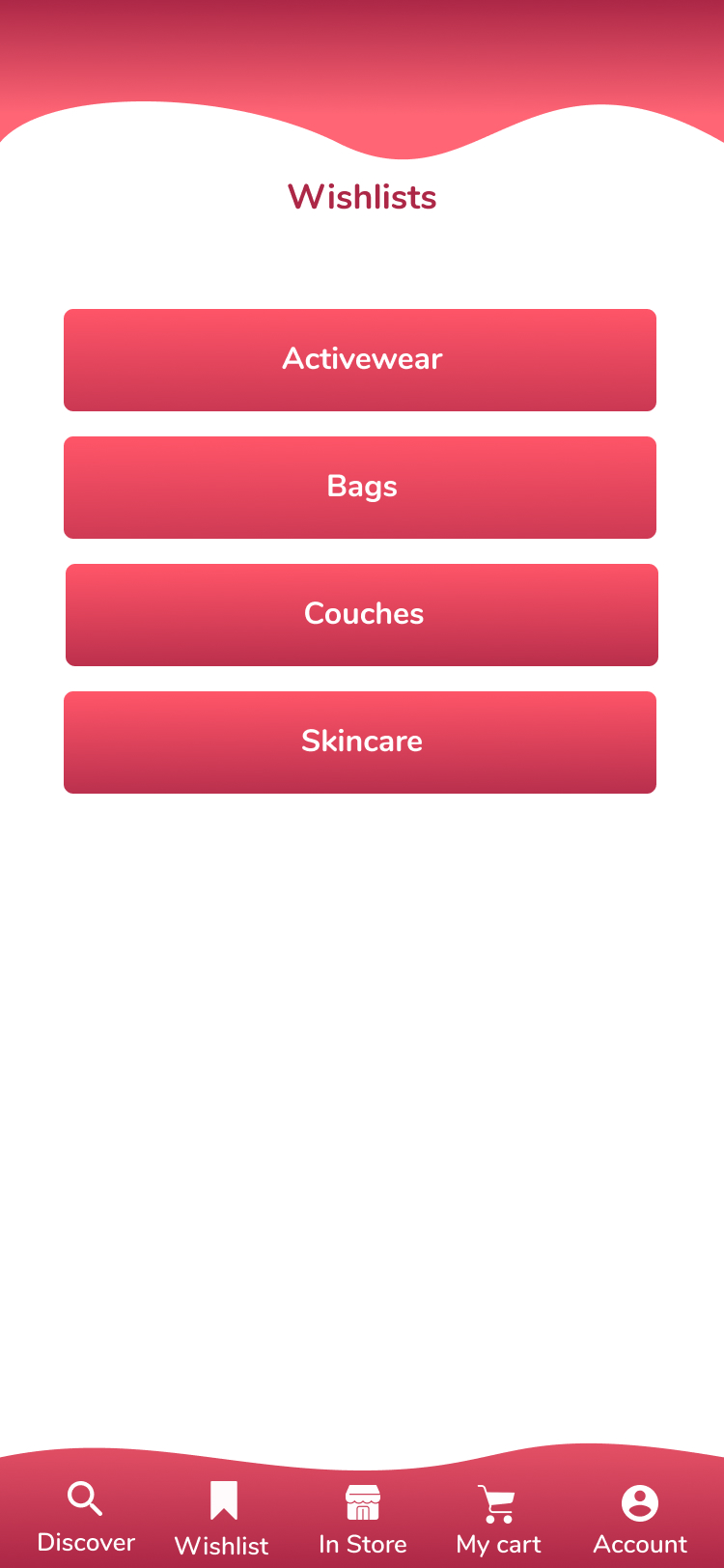
Problem Statement: Reimagine the mobile in-app store directory to intuitively present shoppers with their desired merchants and products, aiding in the discovery of new stores and items aligned with their interests.
Primary User Group
Our project is tailored to address the needs of college students who are new to Sezzle and lack a credit history.
Design Process
How we got to our final design:
Step one:
To kick off our project, we conducted a comparative analysis to examine existing products in the market. The key insights we gathered from this competitive analysis revealed that there were fewer and more ambiguous categories available to assist users in finding what they need. Consequently, these limited options often hindered user choices. Additionally, we discovered that lesser-known merchants heavily rely on products being discovered by new shoppers.
Step four:
Our professors and sponsors urged us to think creatively within the open-ended project scope. To facilitate this, we developed two concepts: ‘normal’ and ‘blue-sky’. The ‘normal’ concept aimed to enhance Sezzle’s current interface by surpassing competitors’ designs while remaining feasible for timely implementation. Conversely, the ‘blue-sky’ concept enabled us to explore an alternative prototype solution, unconstrained by Sezzle’s existing architecture or functionality. This approach allowed us to push design boundaries by envisioning a self-contained shopping experience within the app. With this goal in mind, we devised two distinct wireframe concepts to capture both viewpoints.
Step two:
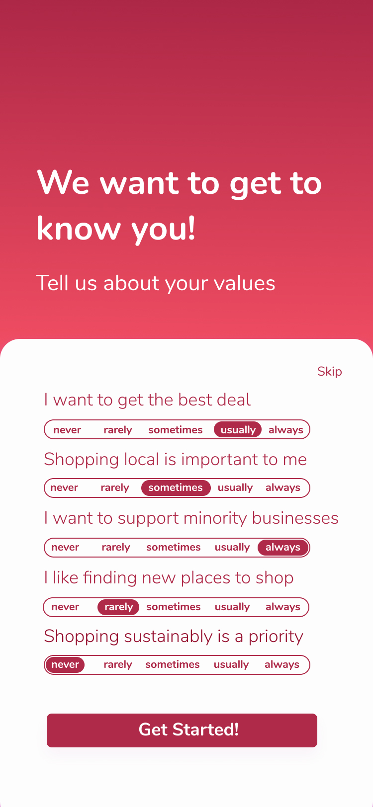
Prior to conducting interviews, we designed a screening survey to identify common traits among our target user group and select individuals who had never used a BNPL service. Following the interviews, we focused on understanding user shopping motivations, identifying pain points, and assessing the impact of financial status on shopping behavior. Our analysis led to the creation of journey maps to visualize various stages of the shopping experience. Subsequently, we developed a persona and refined our solution to better meet the needs of our target user group.
Step five:
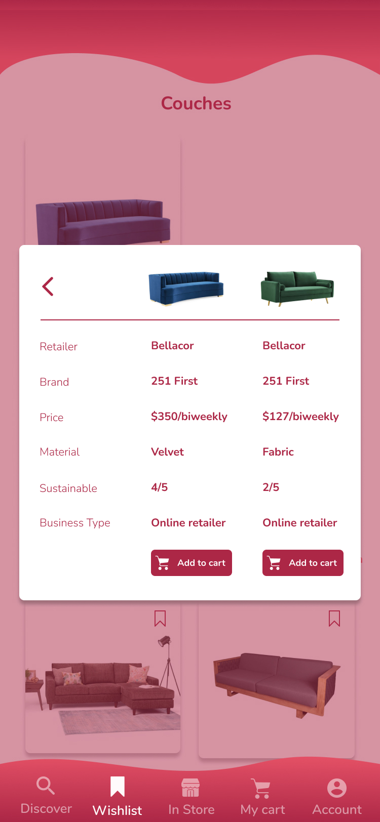
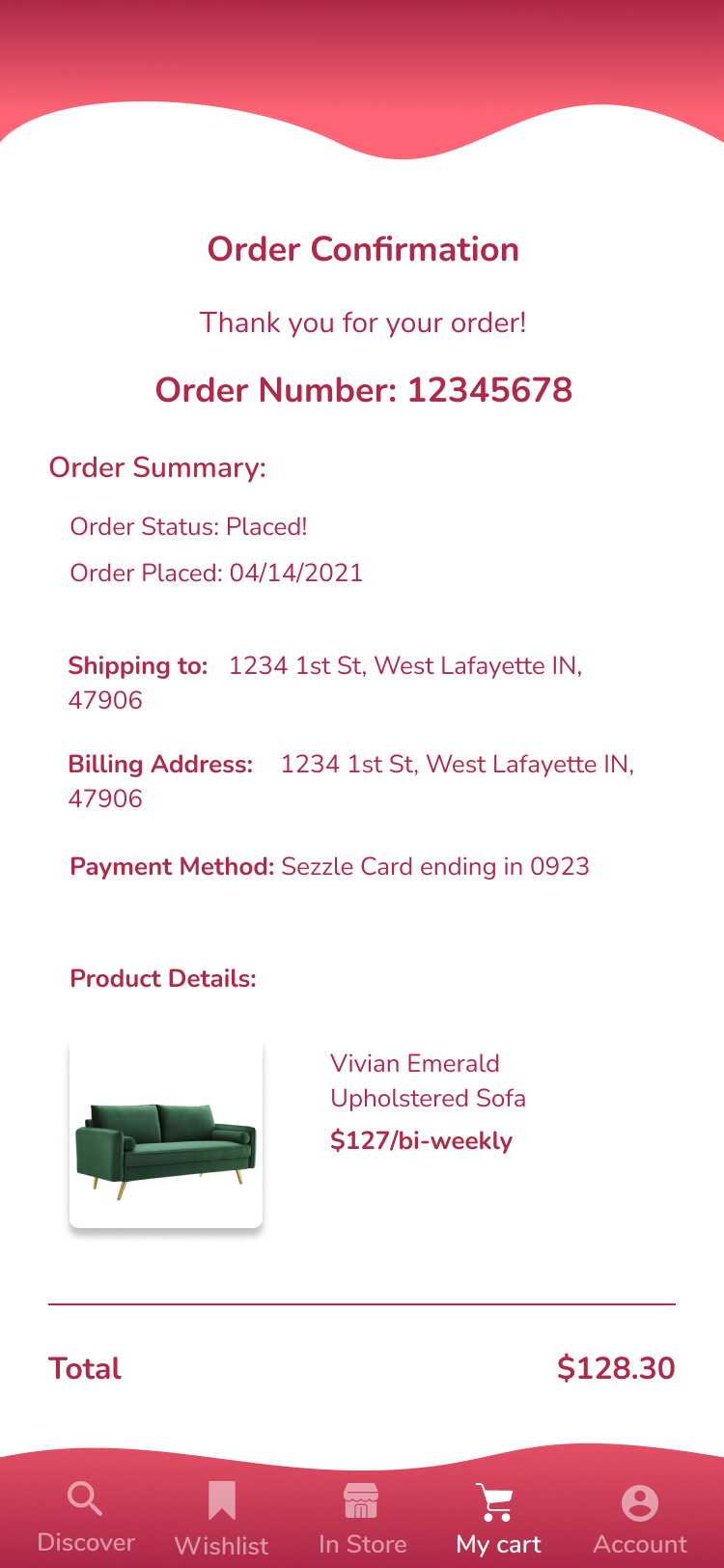
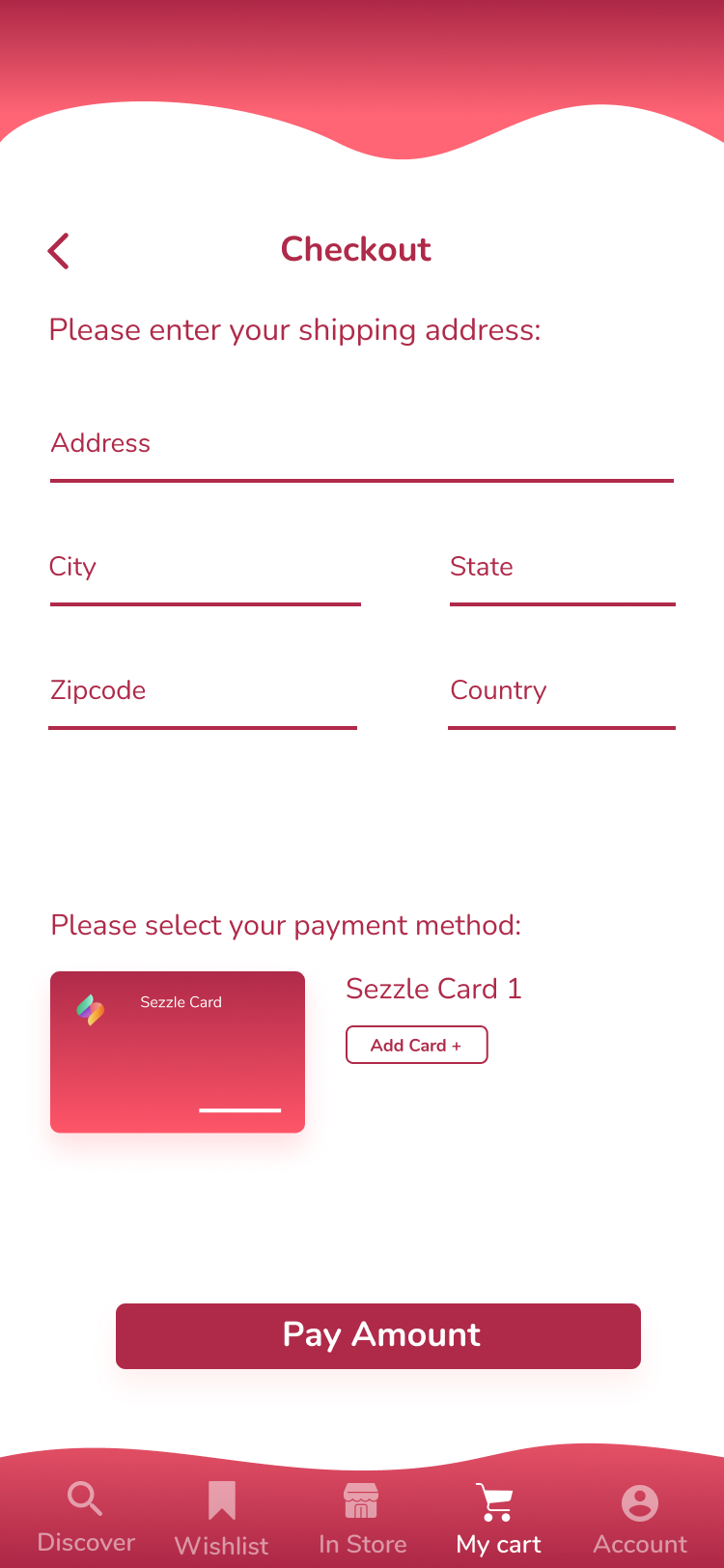
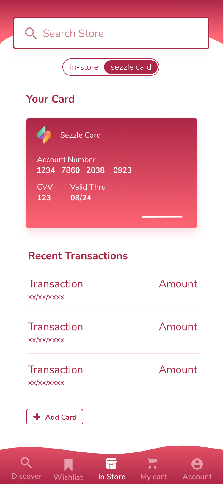
In order to finalize which concept we wanted to aim towards for the final design, we decided to seek user validation, in the form of A/B testing in order to compare both designs and to observe and learn the user’s thoughts on the progression of events, determine areas for improvement, and identify the user’s value of each concept. Our main takeaways from this test was that users enjoyed a signup code, found detailed product information and product comparison features to be helpful, and that it was preferable to pay within the app for BNPL services. These takeaways led us to choosing the blue sky concept moving forward, as most of these liked features were features of the blue sky concept.
Step three:
Having identified our user group, we promptly engaged in the ideation phase. We initiated multiple rounds of sketching to generate designs inspired by our hypothesis statements and to visualize an enhanced app flow. Our ideation process followed two distinct approaches: one focused on standard feature concepts, while the other explored ‘blue sky’ ideas, allowing us to experiment with presenting app features from a unique perspective.
Step six:
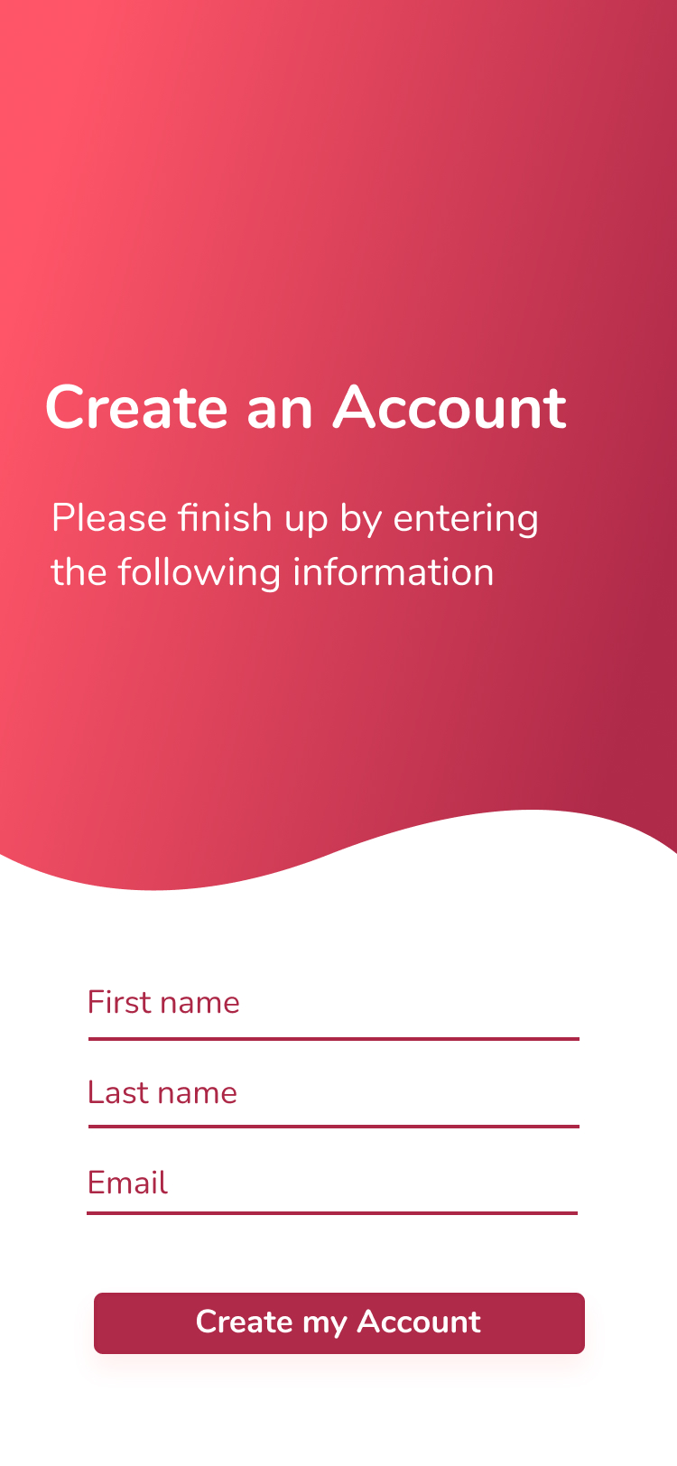
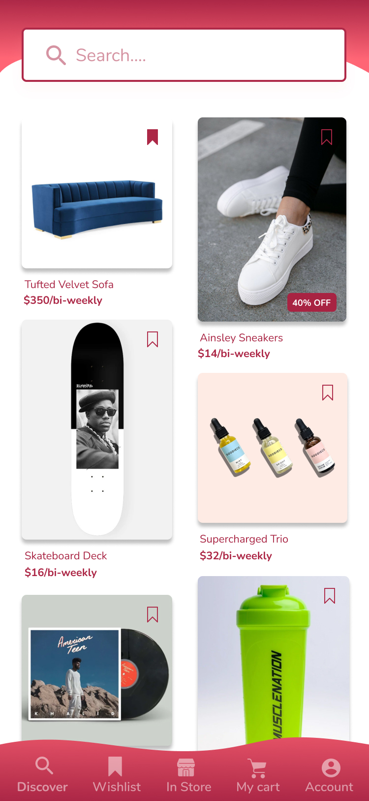
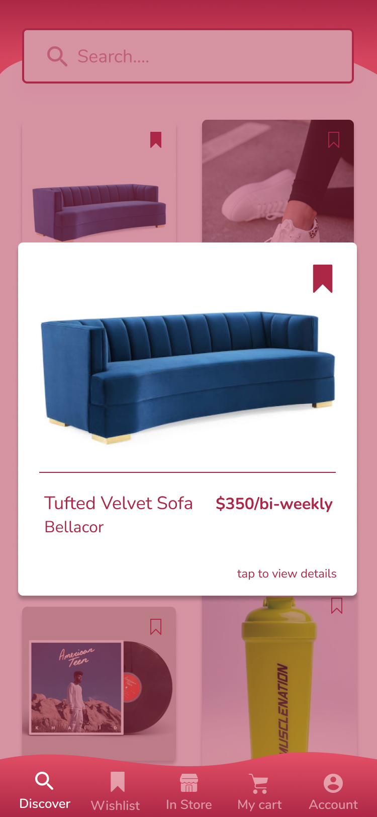
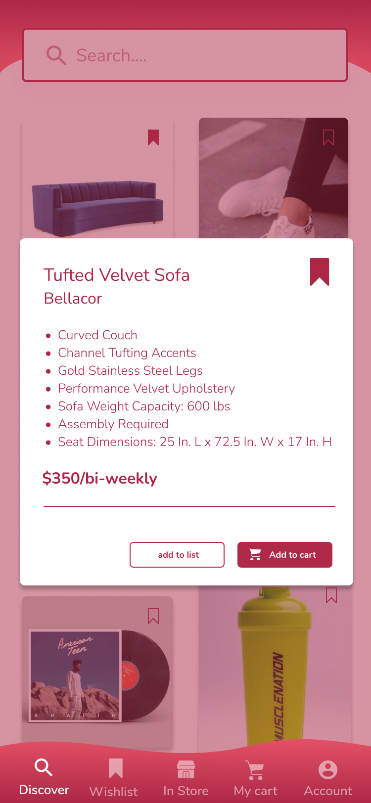
We proceeded to design medium-fidelity mockups of the ‘blue sky’ concept and conducted another round of usability testing. Feedback highlighted poor navigation on the search page and complexity in product comparison selection. In the final prototype, I led the rebranding effort, suggesting potential color schemes and overall UI branding for the app. Enhancements included streamlined onboarding, personalized options, a search feature recommending brands based on queries, and more. Upon completion, we delivered the final design and a transition document outlining recommended improvements for our sponsors’ consideration.
Final Solution
Want to check out the final prototype:
Click the button below to open up the final prototype and explore it’s entire flow.