
Enhancing Madewell’s Online Shopping Experience – A UX Case Study
Duration
June – August 2021
Contributions
Secondary Research
Competitive Analysis
Wireframing/Prototyping
User Testing
Manager
Rosanna Volis
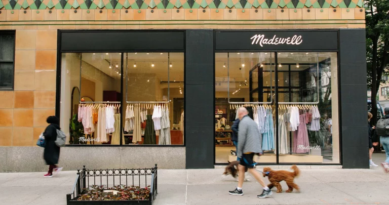
About Madewell
Madewell is a daughter brand of J.Crew and it is known for its quality of clothing for young professionals. This brand has made a name for itself with its signature denim and trendy staples, and customers were drawn to the brand’s personal, friendly company culture.
Internship
Roles
As a User Experience Design Intern, I have achieved the following during my time there:
1). Developed multiple prototypes for Madewell’s returns pages using tools like Sketch to Improve and simplify the overall returns experience for the customers.
2). Conducted competitive research for the Madewell Returns Pages and Gift Card user experiences, and cataloged the findings and my recommendations for the UX team.
3). Acquired and utilized the skills for conducting user research to understand customer behavior, and applied those while designing the interfaces for the returns page.
4). Participated in the multiple customer reviews and user tests on the FitQuiz product and analyzed the finding and reviewed with the UX team.
Project Goal
For this summer, I was tasked to redesign Madewell’s Return Page. They wanted me to create a design that would be more clear to users and allow them to locate return/exchange options more easily. Some problems that were noticed in their original design was that it was unclear how to locate the various return and exhange options they had. In addition to that, the page was very text heavy and required users to read the page very clearly if they had questions about return and exchange process.
Project Process:
Step One:
I opened up Madewell’s Return Page (it’s previous design) and started writing down any usability issues that I could identify. From there, I shared the insights with my manager and we compared our insights to see what was similar and different.
Step Four:
After designing the low-fidelity prototype, I got feedback from my manager about my design and made changes by refining the amount of text that was on my design and keeping the colors and design similar to other pages the company has designed.
Step Two:
After identifying the current usability problems in the previous Return’s Page Design, I conducted a round of competitive research in order to see what other companies have done with their return pages. I was able to get some ideas on how to reformat the existing Madewell return page and what could be important elements to keep in mind when creating a new design.
Step Five:
I turned the designs that I received feedback on to medium-fidelity prototypes. As I worked on turning them into a higher quality prototype, I incorporated some of the icons and colors from the design library (provided by Madewell).
Step Three:
From there, I started sketching out wireframes for my first design round. Using the sketches I drew up, I turned them into a low fidelity prototype.
Step Six:
After turning my designs into medium-fidelity prototypes, I passed down the designs to my manager who then made some formatting changes and made it fit more to the theme of the website. I recently checked the return’s page and they have used one of the designs that I passed down to them. Definitely check it out!
Website Prototype:
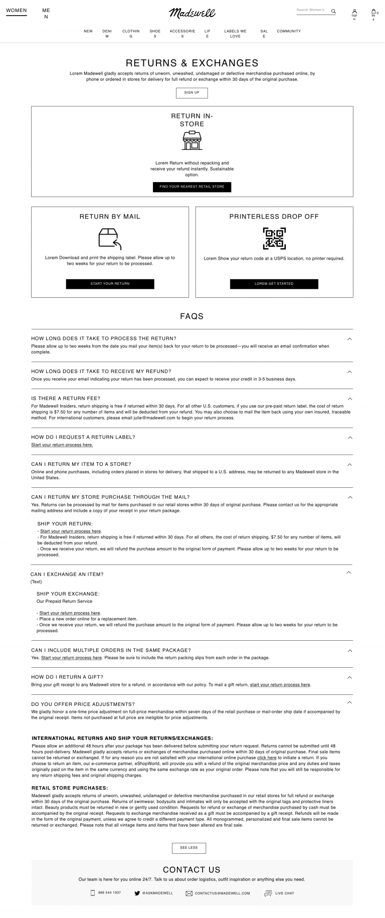
You can check out the current Madewell Design here at: https://www.madewell.com/returns.html
Fit Quiz: User Testing Results
During my time as a Madewell Intern, one of the fun tasks I got to do with my team was sit in on user testing sessions. The UX team started testing on one of their upcoming products called the Fit Quiz where customers can scan a code and take a quiz about which jeans and style of jeans they would want to shop for. I sadly do not have the images for this prototype as the designing process it was still in progress when I was working there. Below is the summarized results from the testing sessions:
1). Introduction Page: many participants thought that the opening blurb had enough context to tell them what the quiz was about. The photos helped give participants a visual for context. Also, participants loved that there was size inclusivity involved with the quiz.
2). Height Page: It is overall very clear to participants but there were questions about the inseam of clothing and how it works when finding a pair of jeans. Participants also included that plus sizes should not be on a separate section of the page as it feels strange that it is not being included on the main page with the regular sizes.
3). Body Shape Page: It is very inclusive to different body shapes that exist for people. But participants questioned whether the body shapes imagery matched with the descriptions provided (context should be included).
4). Style Page: Participants liked the variety of styles that were shown on the page, though they were confused with how distinguished each style was and how it matched the images shown.
5). Pant Legs Page: It was a pretty clear and easy to understand page for users. Along with this, it described what the jeans provided. The one thought users had was there sound be reclarification of what “easy” and “slim” pant legs are.
6). Rise page: Overall, it was a very easy page to understand for users and it helps them narrow down the decision of what types of jeans they would wear.
7). Stretch page: This page was unclear to users as to what types of jeans they would pick for stretch. Some of the images did not match the descriptions/styles that were being shown.
8). Loading Page: This was a very visually pleasing page for users and it makes them feel intrigued about the results they would soon get. Along with that, users loved the icons that were used.
9). Results Page: Overall, participants loved all aspects of this page as it gives good context on the jeans that were being recommended to them. And the reviews made it helpful for users to see what others thought of the styles that were being recommended to them.