Experience Studio II: Cerner
Duration
4 Months (Fall 2019)
Contributions
Primary Research
Secondary Research
Prototyping
Teammates
Hayley Farmer, Anna Ding, Jingle Chen, Alicia Zhang, Christian Espinoza, Zoe Morken
What is Cerner
Cerner has been a supplier of information health solutions. They have worked at the intersection of healthcare and information technology to let individuals engage in their own health and to provide connections to people around the world. Cerner supports their clients by helping patients and their doctors make informed decisions to provide smarter care. By providing empowerment and engagement, they hope to transform the way health care is delivered.
Project Goal
For this project, we are encouraged to explore a new communication channel for patients and healthcare providers. We intend to empower patients with a new method to gain the clarification or support they need. Our main goal is to identify and alleviate miscommunication taking place between doctors and patients before, during, and after a visit. The project will be focused on research and ideation, with a potential for creating a new product as a final target.
Problem Statement and User Group
Our main goal for this project has been to improve on informing college students about what to do and how to seek help from healthcare providers when they get sick. More specifically, encouraging college students to reach out to healthcare resources early with the onset of illness, so that they can be assisted properly through recovery.
Design Process
Exploration Process
Given the broad initial problem space, narrowing our focus and finding the right problem to solve was crucial. Our approach involved selecting a direction based on assumptions or research insights and quickly exploring it. We aimed to identify a potential gap in communication and then research its viability. Throughout this process, we presented our ideas to professors and sponsors for feedback, leading to several major pivots. In this section, we introduce three major directions we explored, with detailed research insights and design rationales provided later.
We explored three major directions: “Elderly,” “Medical Record Management,” and “Healthcare Transition.”
- Elderly: We initially targeted elderly users, assuming they have a greater need for communication with healthcare providers. However, we lacked access to this user group for research.
- Medical Record Management: We then considered helping patients manage their own medical records to ease the transfer between primary providers and specialists. However, interviews revealed no significant demand for this solution.
- Healthcare Transition: Our current focus is on healthcare transition, helping individuals take responsibility for their health-related information and activities.


Goal: To start the project, each of us individually created a journey map. These journey maps were designed to summarize our own experiences with healthcare and identify potential opportunities.
Takeaways: Interestingly, we utilized multiple angles in our approach, each of us focusing on different aspects while creating the journey maps. This provided valuable insights. We found that communication is particularly difficult before and after visiting a healthcare provider since face-to-face interaction is not possible. Visiting a doctor can cause some people to panic, and the experience of visiting healthcare providers can vary. As college students, we don’t see doctors often—at most twice a year—because we consider ourselves relatively healthy. This last insight led us to focus on an older age group as our initial project direction.
Comparative Research
Goal: We aimed to understand how people currently share their medical records between healthcare providers. Since Electronic Medical Records (EMR) are extensively used for this purpose, we also examined the key functions of major EMR systems.
Process: There are three major ways to share medical records: through EMRs (Electronic Medical Records), mailing physical documents, and patients summarizing other doctors’ prescriptions.
EMR Functions:
- Health information and data
- Result management
- Order management
- Decision support
- Electronic communication and connectivity
- Patient support
- Administrative processes and reporting
- Reporting and population health
Takeaways: Current EMRs have effectively facilitated the transfer of medical records within their own systems. However, transferring records within the same system is significantly easier.
Healthcare Transition
Upon realizing that elderly individuals managing their own medical records was unnecessary, we decided to rescope the project. Given the duration of our project and the challenges in arranging meetings with people within the elderly demographic, we shifted our focus to college students. Further narrowing our focus, we explored the theme of healthcare transition, defined by us as the process of individuals taking responsibility for their own health-related information and activities..
Problem Framing Process

Asking Questions: To initiate problem framing, we conducted both a survey study and an expert interview. The survey aimed to verify our assumption about the scope, which is that college students lack the necessary knowledge to navigate healthcare transitions. Subsequently, we interviewed a nurse practitioner from PUSH (Purdue University Student Health Service). Insights from this interview swiftly led us to our first problem frame: encouraging students to ask more healthcare-related questions.
Onboarding: Upon receiving additional feedback from our advisors, we recognized that the challenge of encouraging students to ask questions about healthcare stemmed from their lack of knowledge in the field. Consequently, despite their confusion, they may not know what constitutes a good question or how to seek help. Following a rapid ideation session, we proposed that assisting students in onboarding to the current healthcare system could be a viable solution to this challenge.
“What’s wrong with me?”: Following discussions with our sponsors, both our team and sponsors agreed that our initial approach wasn’t ambitious enough. While addressing the disconnect from current healthcare systems is one communication gap, we identified broader gaps. To gain a comprehensive view of Purdue students’ current healthcare experiences, we created an experience map. We observed that at the early stage of illness, the most common question or concern is “what’s wrong with me,” inevitably leading to “what should I do?” Consequently, we aim to better inform college students about what to do and how to seek help at the early stages of illness.
Purdue University Student Health Center Interview
Goal: To gain insights from the provider side of patient–provider communication, we interviewed Gwen Richardson, a nurse practitioner at Purdue University Student Health Center (PUSH). Although our focus had shifted slightly from general healthcare transition to encouraging students to ask their providers questions by the time we scheduled the meeting with PUSH, we believed the interview would still offer valuable insights. Fortunately, our interviewee provided us with a baseline understanding of the inner workings of PUSH and identified barriers when communicating with students.
Takeaways: Here is what we took away from interviewing Gwen from PUSH:
- Cost transparency is crucial for students, and both our interviewee and PUSH prioritize honesty about appointment expenses to prevent unexpected bills.
- Many students lack healthcare knowledge, as Richardson notes that some are unfamiliar with their health insurance and medication. Providers often need to search through medical records or contact primary doctors for information.
- Despite having access to the PUSH patient portal, students under-utilize it. Providers encourage communication through this channel, but students often overlook notifications or mistake them for spam.
- Due to their lack of preparedness in managing healthcare, students may not voice questions or concerns. Richardson aims to foster an environment at PUSH where students feel safe to share health-related issues and seek clarification.
Journey Mapping

Process: Drawing from our project’s scope, we crafted an experience map to illustrate various scenarios students may encounter while utilizing PUSH’s services on campus. We delineated five distinct phases: pre-college, vaccination, falling ill, facing a severe illness, and post-college.
During our sponsor meeting, we presented the map for evaluation. The team expressed particular interest in the “falling ill” stage, recognizing it as a pivotal point where students are more likely to seek PUSH’s assistance before visiting the facility themselves.
Having identified the “falling ill” phase as our primary focus, we revisited the experience map, enhancing it with additional details tailored specifically to this stage.
This map was informed by the questions and concerns students face during the early stages of illness, encompassing inquiries about appropriate medication, severity, and recovery methods. We distilled these concerns into two overarching questions:
- What’s wrong with me?
- What should I do?
Ideation
Process: After conducting research to delve deeper into our target group and pinpoint the primary pain points, we initiated an ideation phase. Some of our standout ideas included:
- Medical questionnaire
- Medical checklist
- PUSH onboarding process

Medical Questionnaire: An app designed to store appointment information, aimed at empowering students to ask questions before or after their appointments.
Medical Checklist: A tool intended to guide students through their medical transition and foster medical independence throughout their college career. Accessible via myPurdue or the current PUSH portal, this checklist aimed to provide structured support. However, one area of improvement for this idea was its engagement factor.


PUSH Onboarding Process: The primary aim of this concept was to streamline students’ access to information, reducing the need for verbal inquiries. Through a mobile PUSH portal, students could find answers to most of their questions.
Low-Fidelity Wireframes & Initial Testing

Process: After sketching our ideas on the whiteboard, we transitioned to Figma to create low-fidelity prototypes. This allowed us to align on layout and provided a clickable prototype for concept testing.
We prioritized concept testing over usability testing to assess the viability of our prototype ideas and gather feedback on potential improvements. We conducted tests using two different prototypes: the Figma prototype and our paper prototype.
Figma Testing: During the Figma testing, we interjected with questions to gauge users’ familiarity with chatbots and their approach to managing sickness. Towards the end of the usability testing, we solicited feedback on our prototype. Some initial questions included:
Chatbots:
- Do you understand what a chatbot is? If so, what do you associate with it?
- Have you interacted with a chatbot before? If yes, could you describe the context?
- How satisfied were you with the overall chatbot experience?
Dealing with Sickness:
- What steps do you typically take when you realize you’re getting sick?
- Have you ever sought assistance from PUSH due to an illness? If yes, what influenced your decision? Please elaborate.
Takeaways: Users expressed greater trust and reliability in our solution compared to searching symptoms on Google, validating our approach. There was significant confusion regarding the diagnosis page. Users strongly recommended adding a progress bar to the survey to track completion status. Users preferred a wizard interface over a chatbot.
Following user testing and feedback collection, insights revealed:
- Users envision themselves using this solution when they fall ill.
- Feedback focused on design concept rather than UI, highlighting both likes and dislikes.
- When compared to a typical chatbot UI, our design resonated more with users.
- Users preferred our design concept over traditional web search.
- Suggestions for improvement were also provided.
Final Prototype
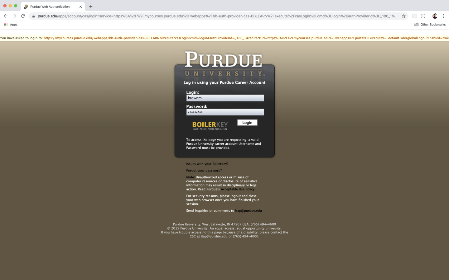
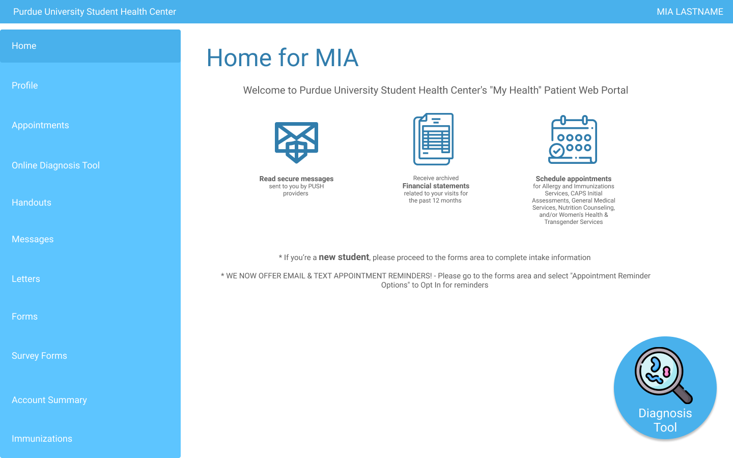
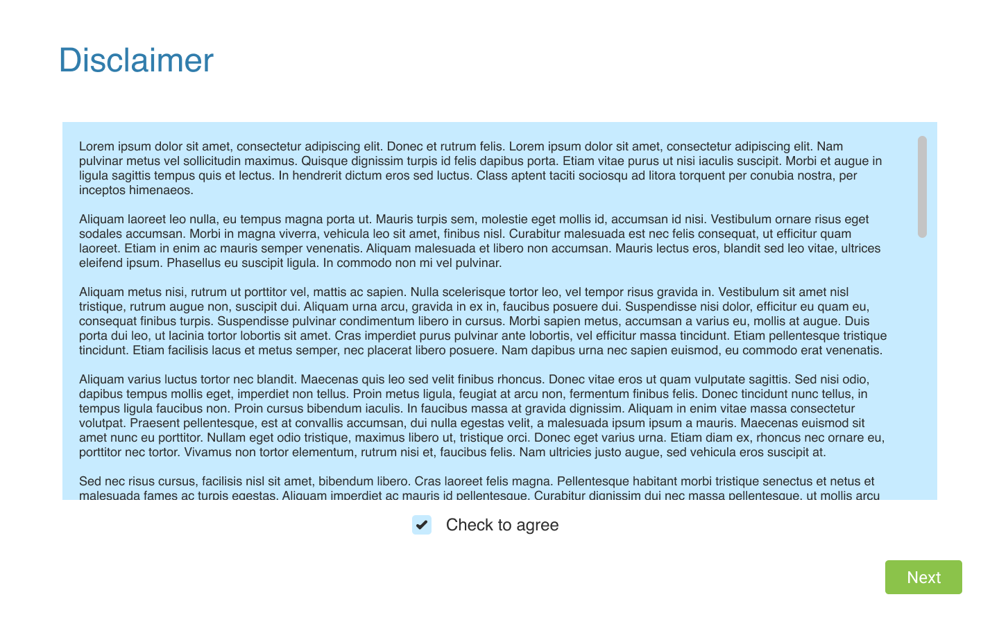
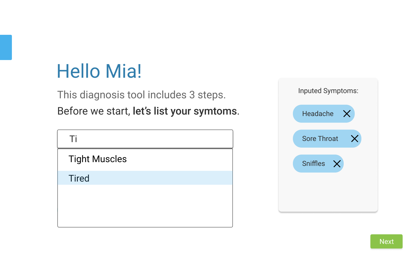
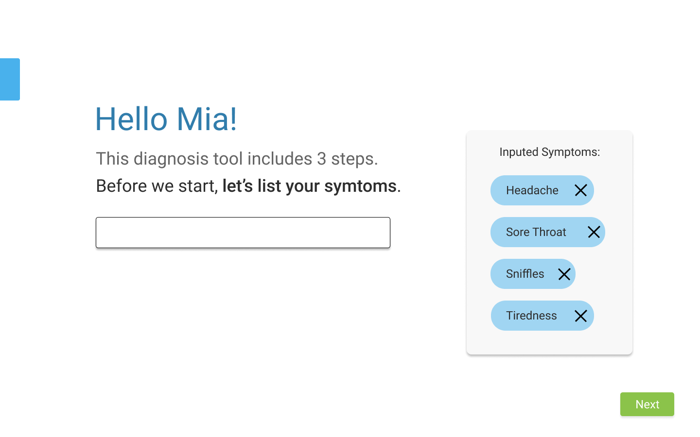
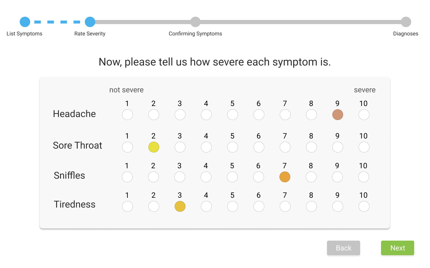
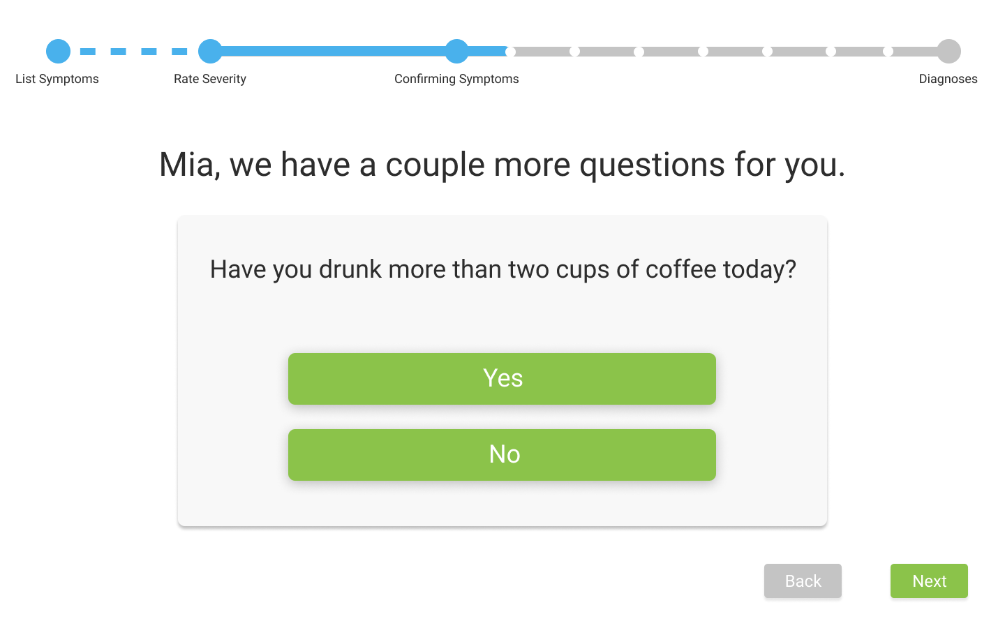
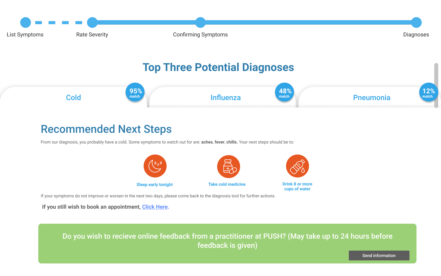
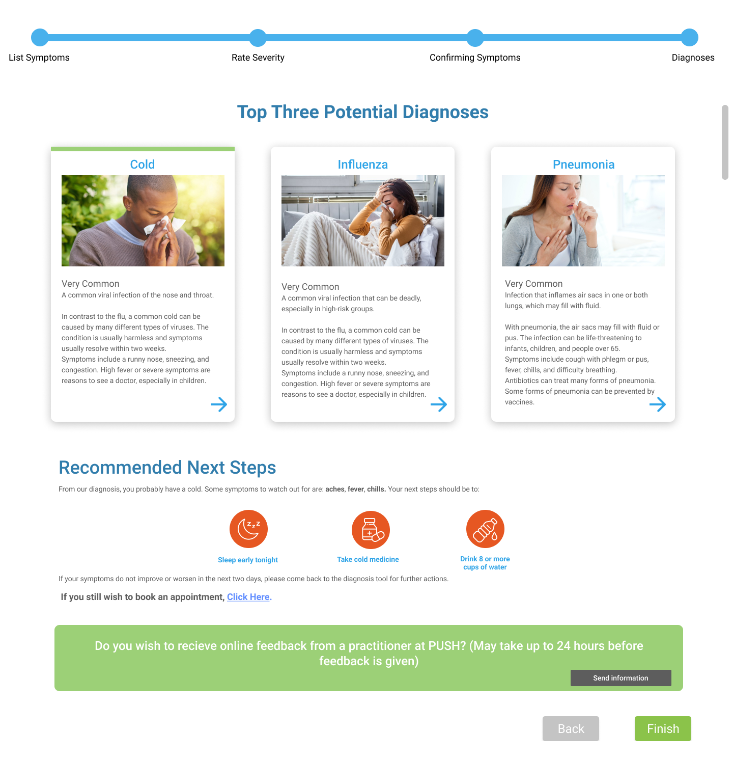
The images in the carousel correspond to the prototype flow. Here’s a textual walk through of each screen, detailing how users would interact with them.
1), The user first logs in with their user credentials.
2). The PUSH home screen has been revamped to provide guidance for new users on how to use the PUSH portal effectively. Additionally, the tool has been renamed to “Diagnosis Tool,” reflecting its transition away from a chatbot functionality
4). & 5). On the input of symptoms page, the display of symptoms has been redesigned into a more visually appealing bubble format.
6). For the rating selection scale displaying the severity of the symptoms, the user can select one dot out of 10 to indicate the severity of each symptom they have. As they make their selection, the chosen dot changes color, providing visual feedback on the severity rating.
8). After completing the questionnaire, users will be directed to the diagnosis page. Here, they receive information about potential conditions based on their symptoms. They can navigate through different tabs to explore matches for the symptoms they are experiencing.
9). The final page provides users with steps to initiate the recovery process. Additionally, it offers the option to request an appointment with a doctor if they wish to confirm their illness.
Link to Final Prototype Walkthrough:
Want to read the full design process...
Click the button below to read our fully design process and explanation on our entire final prototype. In this documentation, you will get to read about how our research and ideation got us to our design and why we went with the solution that we produced.
